I struggled for so long with Claude, and I get tired with its max msg length after a long chat, that’s why I went to ChatGPT. Anyways, I tried with Claude for a while until it ran out of msg length, and here is the latest code node logic it gave me.
{
“nodes”: [
{
“parameters”: {
“method”: “POST”,
“url”: “https://quickchart.io/chart”,
“sendBody”: true,
“specifyBody”: “json”,
“jsonBody”: “={\n "version": "2",\n "backgroundColor": "transparent",\n "width": 500,\n "height": 300,\n "devicePixelRatio": 1.0,\n "format": "png",\n "chart": {{ JSON.stringify($json.chart) }}\n}”,
“options”: {}
},
“type”: “n8n-nodes-base.httpRequest”,
“typeVersion”: 4.2,
“position”: [
520,
20
],
“id”: “41f29b32-a509-4268-b1ec-5cca74dae5a7”,
“name”: “HTTP Request”
},
{
“parameters”: {
“jsCode”: “const raw = $json.output;\nlet rawStr = ‘’;\nif (typeof raw === ‘string’) {\n rawStr = raw;\n} else if (raw !== undefined && raw !== null) {\n rawStr = JSON.stringify(raw);\n} else {\n throw new Error(‘The value of $json.output is empty or not defined’);\n}\nconst stripped = rawStr\n .trim()\n .replace(/^json\\n?/, '')\n .replace(/$/, ‘’);\n\nlet parsed;\ntry {\n parsed = JSON.parse(stripped);\n} catch (err) {\n throw new Error('JSON parse failed: ’ + err.message);\n}\n\n// Build the chart configuration\nconst chartConfig = {\n type: parsed.chart_type,\n data: parsed.chart_data,\n options: parsed.chart_options || {}\n};\n\n// Detect if this is a dual-axis chart\nconst hasDualAxis = chartConfig.data.datasets && \n chartConfig.data.datasets.some(dataset => dataset.yAxisID === ‘y1’);\n\nif (hasDualAxis) {\n // Ensure proper dual-axis configuration\n \n // Fix datasets - ensure all have explicit yAxisID\n chartConfig.data.datasets.forEach((dataset, index) => {\n if (!dataset.yAxisID) {\n dataset.yAxisID = index === 0 ? ‘y’ : ‘y1’;\n }\n \n // Fix invalid colors - convert named colors to valid CSS colors\n if (dataset.borderColor === ‘blue’ || !dataset.borderColor) {\n dataset.borderColor = index === 0 ? ‘rgb(75, 192, 192)’ : ‘rgb(255, 99, 132)’;\n }\n if (dataset.backgroundColor === ‘blue’ || dataset.backgroundColor === ‘red’ || !dataset.backgroundColor) {\n dataset.backgroundColor = index === 0 ? ‘rgba(75, 192, 192, 0.2)’ : ‘rgba(255, 99, 132, 0.2)’;\n }\n \n // Remove problematic point properties that QuickChart doesn’t handle well\n delete dataset.pointBackgroundColor;\n delete dataset.pointRadius;\n delete dataset.pointHoverRadius;\n });\n \n // Ensure proper scale configuration\n if (!chartConfig.options.scales) {\n chartConfig.options.scales = {};\n }\n \n // Configure primary Y-axis\n if (!chartConfig.options.scales.y) {\n chartConfig.options.scales.y = {};\n }\n chartConfig.options.scales.y.type = ‘linear’;\n chartConfig.options.scales.y.position = ‘left’;\n if (!chartConfig.options.scales.y.hasOwnProperty(‘beginAtZero’)) {\n chartConfig.options.scales.y.beginAtZero = true;\n }\n \n // Configure secondary Y-axis \n if (!chartConfig.options.scales.y1) {\n chartConfig.options.scales.y1 = {};\n }\n chartConfig.options.scales.y1.type = ‘linear’;\n chartConfig.options.scales.y1.position = ‘right’;\n if (!chartConfig.options.scales.y1.hasOwnProperty(‘beginAtZero’)) {\n chartConfig.options.scales.y1.beginAtZero = true;\n }\n \n // Prevent grid overlap\n chartConfig.options.scales.y1.grid = {\n drawOnChartArea: false\n };\n \n} else {\n // Single-axis chart - ensure basic scale configuration\n if (!chartConfig.options.scales) {\n chartConfig.options.scales = {};\n }\n \n if (!chartConfig.options.scales.y) {\n chartConfig.options.scales.y = {};\n }\n \n if (!chartConfig.options.scales.y.hasOwnProperty(‘beginAtZero’)) {\n chartConfig.options.scales.y.beginAtZero = true;\n }\n}\n\n// Ensure basic chart options\nif (!chartConfig.options.responsive) {\n chartConfig.options.responsive = true;\n}\n\n// Return the complete QuickChart request body as a plain object\nreturn {\n version: "2",\n backgroundColor: "transparent",\n width: 500,\n height: 300,\n devicePixelRatio: 1.0,\n format: "png",\n chart: chartConfig\n};”
},
“type”: “n8n-nodes-base.code”,
“typeVersion”: 2,
“position”: [
240,
20
],
“id”: “c7ae0c90-fd89-4330-903c-96f96d707866”,
“name”: “Code1”
},
{
“parameters”: {},
“type”: “n8n-nodes-base.manualTrigger”,
“typeVersion”: 1,
“position”: [
-60,
20
],
“id”: “dccdc793-274c-469f-8401-e031dff5ba5c”,
“name”: “When clicking ‘Execute workflow’”
}
],
“connections”: {
“HTTP Request”: {
“main”: [
]
},
“Code1”: {
“main”: [
[
{
“node”: “HTTP Request”,
“type”: “main”,
“index”: 0
}
]
]
},
“When clicking ‘Execute workflow’”: {
“main”: [
[
{
“node”: “Code1”,
“type”: “main”,
“index”: 0
}
]
]
}
},
“pinData”: {
“When clicking ‘Execute workflow’”: [
{
“output”: {
“chart_type”: “line”,
“chart_data”: {
“labels”: [
“January”,
“February”,
“March”,
“April”,
“May”,
“June”,
“July”,
“August”,
“September”,
“October”,
“November”,
“December”
],
“datasets”: [
{
“label”: “Average Claims Count”,
“data”: [
18.18,
17.73,
18.73,
15.82,
16.1,
17.5,
18.1,
21.4,
17.4,
19.2,
15.5,
17.6
],
“borderColor”: “blue”,
“backgroundColor”: “blue”,
“fill”: false,
“yAxisID”: “y”,
“pointRadius”: 3,
“pointHoverRadius”: 6,
“pointBackgroundColor”: [
“blue”,
“blue”,
“blue”,
“blue”,
“blue”,
“blue”,
“blue”,
“blue”,
“blue”,
“blue”,
“blue”,
“blue”
]
},
{
“label”: “Average Claim Severity”,
“data”: [
1442.1,
945.3,
1273.4,
1092.33,
1280.36,
973.6,
901.08,
1297.67,
1171.02,
1564.81,
1141.09,
1002.95
],
“borderColor”: “red”,
“backgroundColor”: “red”,
“fill”: false,
“yAxisID”: “y1”,
“pointRadius”: 3,
“pointHoverRadius”: 6,
“pointBackgroundColor”: [
“red”,
“red”,
“red”,
“red”,
“red”,
“red”,
“red”,
“red”,
“red”,
“red”,
“red”,
“red”
]
}
]
},
“chart_options”: {
“responsive”: true,
“plugins”: {
“title”: {
“display”: true,
“text”: “Monthly Claims Patterns - Seasonality Analysis”
},
“legend”: {
“display”: true,
“position”: “top”
}
},
“scales”: {
“y”: {
“type”: “linear”,
“position”: “left”,
“beginAtZero”: false,
“title”: {
“display”: true,
“text”: “Average Claims Count”
},
“grid”: {
“display”: true
}
},
“y1”: {
“type”: “linear”,
“position”: “right”,
“beginAtZero”: false,
“title”: {
“display”: true,
“text”: “Average Claim Severity”
},
“grid”: {
“drawOnChartArea”: false,
“display”: true
}
}
}
}
}
}
]
},
“meta”: {
“instanceId”: “a046b6bda08e9c36a7dd21992f0c74569028f78589ca22f2792845226c8c5d28”
}
}
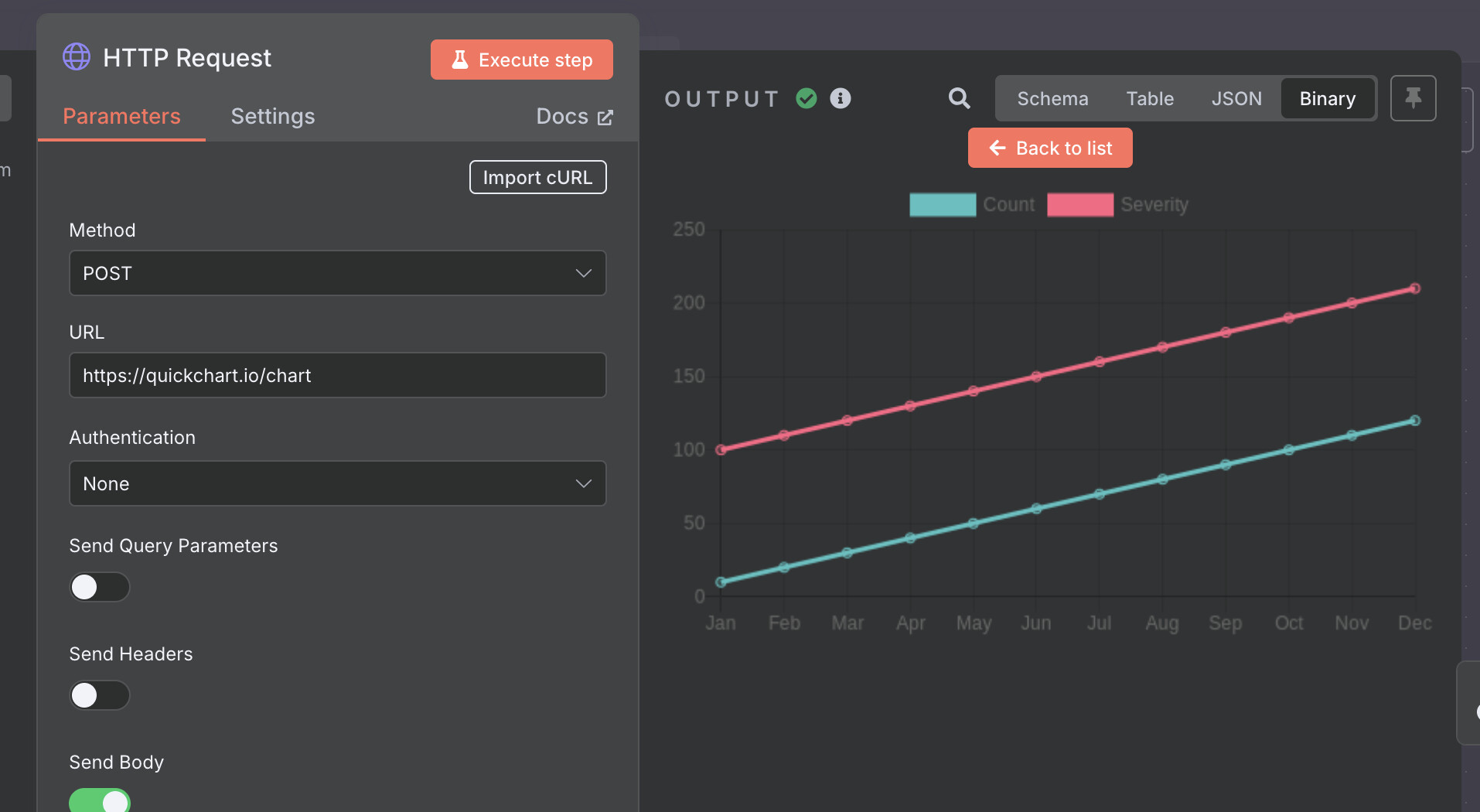
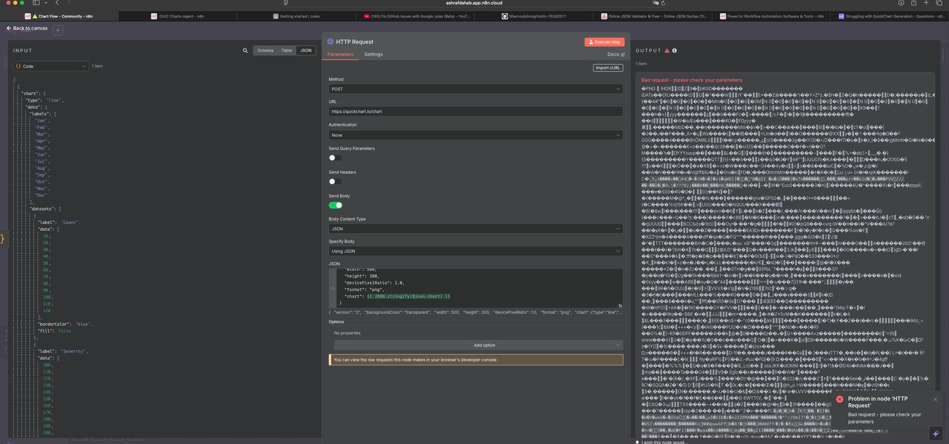
I really just want that chart JSON to be created successfully. Those AIs like GPT or Claude end up in circles, trying the same things over and over. If you can manage to generate a good chart with the exact data I pasted here, that will be great. Right now I get a Bad request in my HTTP node. No matter how many options Claude gave me, I always end up with this error.