Hi everyone, since n8n started to use storybook for the ui elements, im no longer able to modify the color of the ui buttons. For example I want to change the color of the “execute workflow” button, but Im not familiar with story book and can’t seem to find the location where the color codes are specified.
Could someone give me a hint on how to accomplish this? 
hi @nick
We have started moving towards CSS variables as a way to set colors and make it easier to customize the UI. This is still work in progress.
You can see the CSS variables in your inspector and be able to manipulate them there.
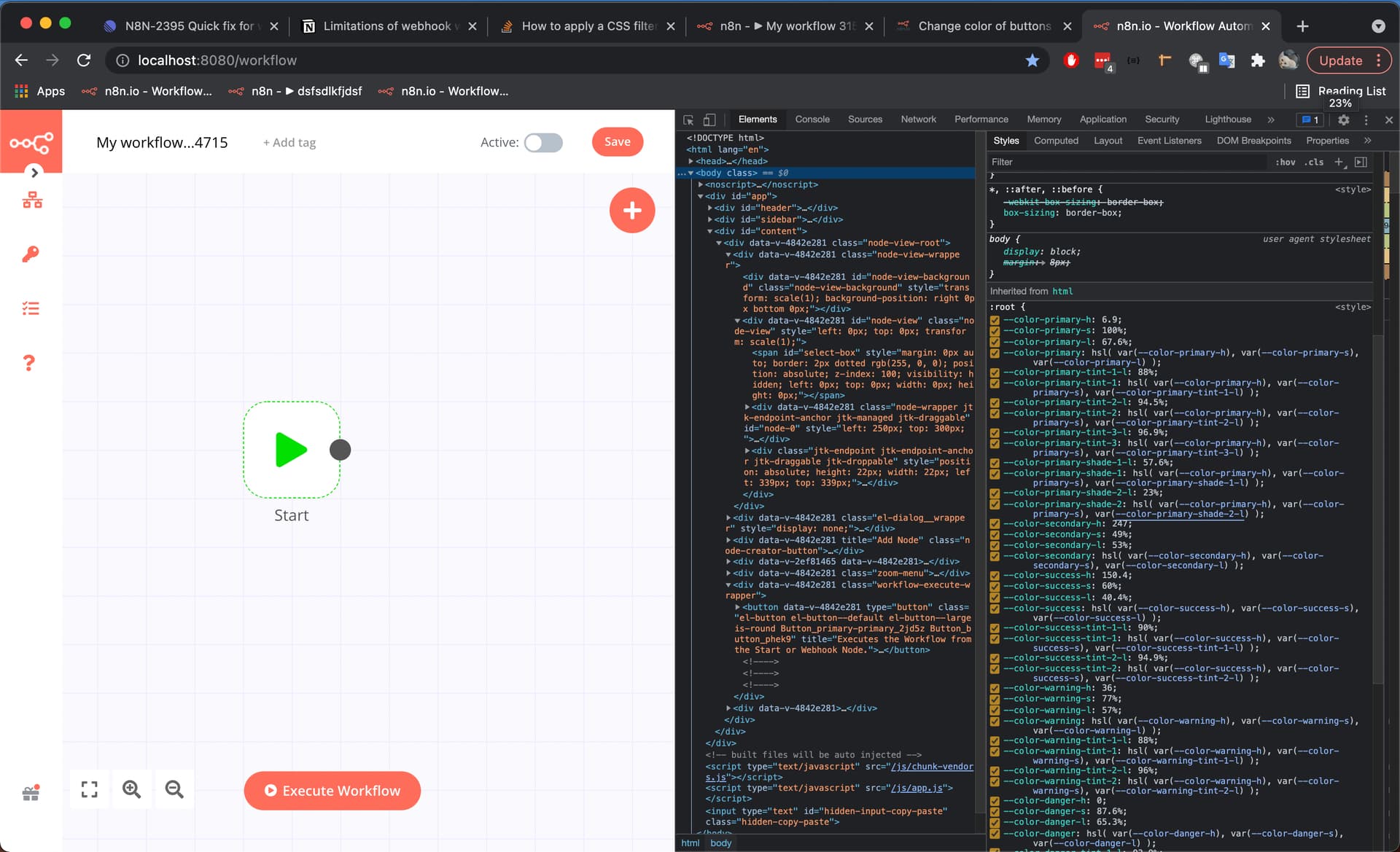
By setting the --color-primary-h to 40 I was able to change all the button colors to yellow…

You can see the main color tokens we have defined here n8n/_tokens.scss at master · n8n-io/n8n · GitHub
There’s a few different options for you to update colors depending on your needs. I would recommend making global changes to minimize the amount of breaking changes as we update the UI.
You can make global changes by updating main color tokens like this:
body {
	--color-primary-h: 40;
	--color-primary-s: 100%;
	--color-primary-l: 67.6%;
	--color-primary: hsl(
		var(--color-primary-h),
		var(--color-primary-s),
		var(--color-primary-l)
	);

	--color-primary-tint-1-l: 88%;
	--color-primary-tint-1: hsl(
		var(--color-primary-h),
		var(--color-primary-s),
		var(--color-primary-tint-1-l)
	);

	--color-primary-tint-2-l: 94.5%;
	--color-primary-tint-2: hsl(
		var(--color-primary-h),
		var(--color-primary-s),
		var(--color-primary-tint-2-l)
	);

	--color-primary-tint-3-l: 96.9%;
	--color-primary-tint-3: hsl(
		var(--color-primary-h),
		var(--color-primary-s),
		var(--color-primary-tint-3-l)
	);

	--color-primary-shade-1-l: 57.6%;
	--color-primary-shade-1: hsl(
		var(--color-primary-h),
		var(--color-primary-s),
		var(--color-primary-shade-1-l)
	);

	--color-primary-shade-2-l: 23%;
	--color-primary-shade-2: hsl(
		var(--color-primary-h),
		var(--color-primary-s),
		var(--color-primary-shade-2-l)
	);
}
If you want to update these colors just for buttons you can similar to above but just apply it to button tags, or even a specific class
button {
	--color-primary-h: 40;
        ....
}
Components have their own css variable as well that would allow you to customize its behavior. For example if you just want to change colors for the execution workflow buttons:
.workflow-execute-wrapper > button {
    --button-color: white;
    --button-border-color: red;
    --button-background-color: blue;
    --button-active-background-color: darkblue;
    --button-active-color: white;
}
Though these are more likely to change as the codebase changes…
Let me know if you have any further questions or any feedback. Again this is still WIP and we are figuring out the best approach to make the UI easily customizable.
7 Likes
Thank you @Mutasem for the answer and the explanation, that’s the file I was searching for 
2 Likes