Hey Freddy, I just ran into the same problem and found a workaround until the form might support ratings. There are 2 caveats:
It doesn’t work if you use other radio buttons on the same form page (or you need to adapt the css)
Browser support is up there but not perfect (all modern browsers support it but only since 2022. It still will work on older browsers but look uglier)
The trick is to use css (Kudos to KevinPowell, the best CSS guy on the internet) and a new selector. So you can paste the following in your form css:
//This hides the radio buttons (display: none is apperently not allowed)
[data-radio-select="radio"] .multiselect-checkbox {
  position: absolute;
  opacity: 0;
  pointer-events: none;
}

//This shows the stars inline
[data-radio-select="radio"] .multiselect-option {
  display: inline-block;
}

//This makes the mouse react to the label
[data-radio-select="radio"] label {
  cursor: pointer;
  font-size: 0;
  padding: 5px;
}

//This adds the empty stars for not selected options
[data-radio-select="radio"] label::before {
  content: "☆";
  font-size: 30px;
  color: #ffd280; //Adjust this color for the outline of the star
  transition: all 0.2s;
}
//Here is Kevins magic. This checks the labels before the selected one and sets the color on all of them.
[data-radio-select="radio"]:has(.multiselect-option:nth-child(5) .multiselect-checkbox:checked) .multiselect-option:nth-child(-n+5) label::before,
[data-radio-select="radio"]:has(.multiselect-option:nth-child(4) .multiselect-checkbox:checked) .multiselect-option:nth-child(-n+4) label::before,
[data-radio-select="radio"]:has(.multiselect-option:nth-child(3) .multiselect-checkbox:checked) .multiselect-option:nth-child(-n+3) label::before,
[data-radio-select="radio"]:has(.multiselect-option:nth-child(2) .multiselect-checkbox:checked) .multiselect-option:nth-child(-n+2) label::before,
[data-radio-select="radio"]:has(.multiselect-option:nth-child(1) .multiselect-checkbox:checked) .multiselect-option:nth-child(-n+1) label::before {
  content: "★";
  color: #ffa500; //Adjust this one for the selected stars
}

//Same thing again but for hovering stars
[data-radio-select="radio"]:has(.multiselect-option:nth-child(5):hover) .multiselect-option:nth-child(-n+5) label::before,
[data-radio-select="radio"]:has(.multiselect-option:nth-child(4):hover) .multiselect-option:nth-child(-n+4) label::before,
[data-radio-select="radio"]:has(.multiselect-option:nth-child(3):hover) .multiselect-option:nth-child(-n+3) label::before,
[data-radio-select="radio"]:has(.multiselect-option:nth-child(2):hover) .multiselect-option:nth-child(-n+2) label::before,
[data-radio-select="radio"]:has(.multiselect-option:nth-child(1):hover) .multiselect-option:nth-child(-n+1) label::before {
  content: "★";
  color: #ffd280; //And this one for the hovering stars
}
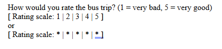
This workaround as is only works for up to 5 stars and I cannot guarantee perfect results but we’ll test it for a small form of ours and check how it’s working.
Edit: there is an even better version by using a background image with an svg star in it to have nicer looking stars and consistent sizing across all browsers. But the Forum blocks me from posting it. Maybe because it uses the css background-image url. Let me know if you need help to add that aswell.